スポンサーリンク
リストをvalueにした辞書型データをmatplotlibでグラフ化する
例えば、下記の辞書型データがあったとします。
valueはリスト型です。
dic = {'month' : [3, 4, 5, 6, 7], 'value1' : [33, 42, 35, 76, 17], 'value2' : [23, 32, 15, 6, 7]}
辞書型データにkeyを指定して、XとYに設定するリスト型データを取り出します。
plt.figure()
x = dic['month']
y = dic['value1']
plt.plotでX,Yを設定します。
plt.plot(x, y, label='value1')
あとは、plt.show()で表示します。
plt.show()
スポンサーリンク
サンプルコード
下記がサンプルコードになります。
サンプルコードでは、2本の折れ線グラフを描いています。
参考:matplotlibでlabelが表示されない時にチェックすること
$ cat sample.py
#!/usr/bin/env python3
# coding: UTF-8

import matplotlib.pyplot as plt

dic = {'month' : [3, 4, 5, 6, 7], 'value1' : [33, 42, 35, 76, 17], 'value2' : [23, 32, 15, 6, 7]}

plt.figure()
x = dic['month']
y = dic['value1']
plt.plot(x, y, label='value1')

y = dic['value2']
plt.plot(x, y, label='value2')
plt.legend()

plt.title('sample')
plt.xlabel('month')
plt.ylabel('value')
plt.show()
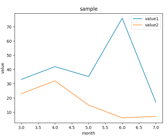
下記が実行結果になります。
スポンサーリンク
